— CASE STUDY
America’s
No Sugar Baker
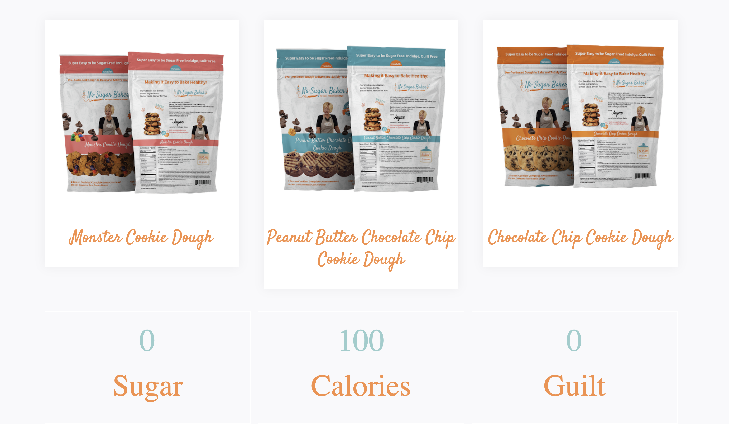
The first zero-sugar Monster cookie, created by America’s No Sugar Baker, entrepreneur Jayne Jones, is launching nationwide on QVC. The brand No Sugar Baker debuts with its first three flavors, Monster, Peanut Butter Chocolate Chip, and Chocolate Chip which tastes just like the original but contains no sugar, and only 100 calories. No Sugar Baker treats will debut on QVC on January 13, 2023 at 11am.
Brandit360 has created product packaging that touches one of the most essential senses we love and desire. Taste, and the love of food. Let’s dig into the catchy and original website and packaging design for America’s No Sugar Baker!
Client
No Sugar Baker
Date
JULY, 2021
Duration
18 Months
Focus
Product Packaging & Brand Strategy
P is for Packaging
And all you cookie monster fans out there know what C is for! So, when America’s No Sugar Baker came to us looking for an original design for her cookie packaging, the desired direction was fun, playful, and delicious! So, we sunk our teeth in (literally) and got to work.
Solution
— The Challenge
Challenge
The packaging needed to stand out on shelves, communicate the deliciousness of the cookies and get across crucial brand differentiators, specifically that the recipes contain ZERO SUGAR.
— The Solution
creative solutions
All of our marketing goals focus on the nature of the product and the problem it solves for the customer. The focus here, was on one particular product that served one cooking goal, ZERO sugar. Our goals for the design was to make sure the brand stood out from the crowd in the competitive market sector of food products and food bloggers.
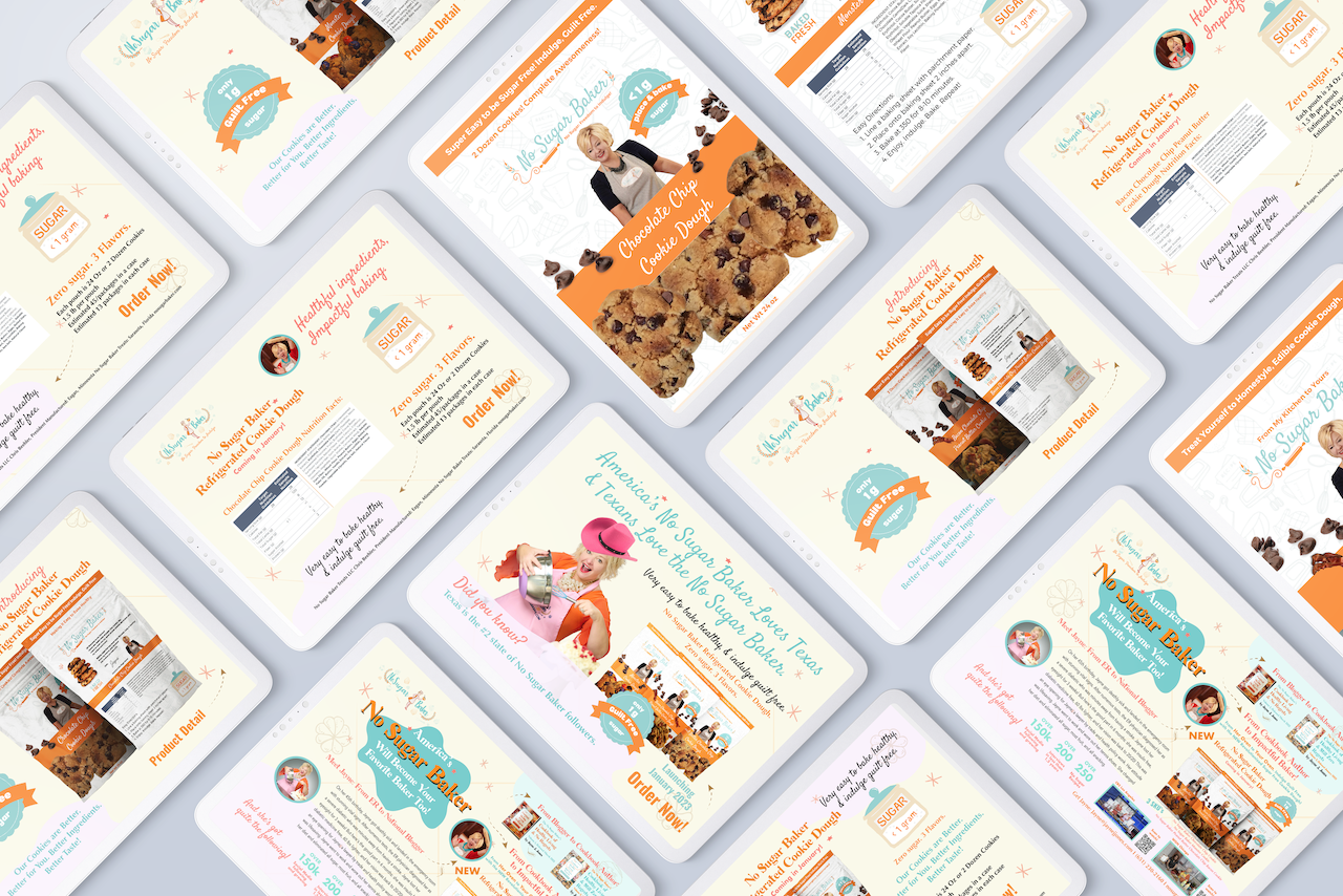
The main visual elements are the cookies, but at the center is Jayne Jones, America’s No Sugar Baker, and that instantly connects the customer to Jayne and creates a connection to the figure they know and love from TV.
Another design feature to mention is the combination of fonts: bold and sans-serif and decorative versions of the Satisfy typeface for brand communication elements, such as titles and taglines, and the stylish but, highly readable Montserrat for directions. Again, information blocks about the product are in Arial, easy to read in small spaces.
Let’s see how the brand approach carried over into the web design and development. Fun and friendly colors, highly desirable packaging design, typography, and a mix of image types, make the user experience enjoyable from the start.
Website Design and Development
Fresh out of the oven is the newly redesigned No Sugar Baker website! Before the successful launch of her new product, we were tasked to bring the new branding and visual identity to their web presence. We created a video reel highlighting Jayne’s television appearances to showcase No Sugar Baker’s playful energy. She’s so sweet, but she’s got the nation talking about NO SUGAR! Her joyful personality shines throughout the site with lively colors, hand-crafted illustrations, and Jayne’s own tasty photography.

DELICIOUS DESIGN
Featuring vibrant colors and custom-designed illustrations that speak to each flavor’s ingredients, the new packaging is super F-U-N! From classics like Chocolate Chip to Monster and Peanut Butter Chocolate Chip, we can’t pick a favorite!
IDENTITY
As a part of the project, we fine-tuned the No Sugar Baker logo, choosing Pantone colors that modernized the wordmark and optimized it for various applications, including the packaging. The end result balances fun and whimsy and sports the Trademark for these practical considerations.
To learn more, visit nosugarbaker.com and follow along on Instagram @nosugarbakertreats

Let’s START A CONVERSATION

LOCATIONS
LOS ANGELES
CHICAGO
Contact
hello@brandit360.com
1.888.362.7263
